Thursday 29 October 2009

What is 'Good' - Part 2

So after doing plenty of research into packaging and promotion in the good ole libary, I decided too focus my attention on a few pieces which I have in my bedroom.  I have taken several pictures of pieces of packaging which are commonly seen.  


I firstly took a look at a more commonly seen bag on the high street.  This 'Jack Wills' bag has a superb quality feel.  The material used feels expensive and strong.  Bright colours and a distinctive but subtle logo seems too be a common technique used by stores.  


Another commonly seen bag - however this 'Officers Club.' bag does not have the same quality feel as the 'Jack Wills' bag, weight and stock is a big issue for price and feel.  


The packaging above was used too store my new Mac charger.  Again, same as the 'Jack Wills' bag this product feels expensive and the packaging has a distinctive 'successful' feel.  The weight and stock as well as the quality of the packaging itself has a massive affect on the products success. 


This is a nice small example of packaging a unique product.  The stock has good weight and is strong.  It holds its product safely in a small area - this packaging therefor fills its role well.  Its distinctive like mentioned above by using its logo and a bright colour, so the audience/purchaser knows what it is and whom its by.  

Tuesday 20 October 2009

What is 'Good' - Part 2


' Worldwide Identity ' has been key too my research process today, below are my favorite pieces of graphic design and packaging. 


Client: Bright Nights USA 
Designer: Matthew Clark 

This piece of work really does appeal too me.  Using small pictograms/illustrations occasionally too put across a message.  Good use of type, and the point size, weight etc! Also I like how it comes in a pack - in a way this would answer our inform/instruct brief?! Defiantly a strong piece too take inspiration from - although the white type on yellow background does not work too well! 


Client: Mobaitec
Designer: Heath Kane

Above is a piece I decided to include because of its use of pictograms.  Since we did a project a couple of weeks ago using pictograms on the brief, i thought this would be nice too include for the printing process also.  Pictograms are a great way of using limited colour, you could use 1 colour (not including stock) or two colour and make great illustrations/imagery.  


Client: SIGN.ID
Designer: Dirk Nolte

I love this piece of packaging for many different reasons, but the main reason was even mentioned in the text.  ' build a world in which one could immerse oneself ' 
From what i get from this is they created a product in which the audience can get very intrigued and explore in depth.  Using white stock but of different weights it would be cheap too print as it uses the CMYK process.  One thing i really dislike about this piece of work is the number of type fonts used, where the type is located and the point sizes.  

What is 'Good' - Part 2

So ... in brief we have a choice: 

Packages & Promotes
- Packages & Persuades
- Packages & Informs

- Packages & Instructs 

Where to go with this, may I remind you, Im doing skydiving ... so I have too package and promote skydiving - more specifically the adrenalin side of it - nightmare!
Anyway below is some of the packaging techniques i came acorss which I photographed, some of these I will be using as inspiration when I design my packaging ... when!
All images below are taken from ' Packaging, Form and Design ' 


I put the image above in, because of the beauty of the print, and the packaging is very clever. Looking at the images closely, the package is produced on a white paper/card stock.  Although the only use for this package is for confectionary, its still very aesthetically pleasing.


The product above is possibly my favorite design I have found so far.  According too the book: 
- ' This box made of recycled paper performs dual functions: as in-storedisplay and as packaging. Once carried home it can be re-assembled into a "TV" to create an unusual interior design element. '
This type of packaging is one element of what we are required too do.  This serves as great inspiration too me for when i start my design process.  Also too consider is how the audience react too the product/packaging, again the design above proves succesful, as explained below: 
- ' It also acts as a communication tool in a unique Freitag promotional scheme: upon sending the registration card to Zurich, Freitag sends the buyer back a paper remote control.' AWESOME! 


Designed in 2004 these cube houses act as a promotion tool for the company.  The bright colours and playful look of the product makes it a win with the audience who naturally want too interact with a product. I love the simplicity of the design, and how through using simple techniques they make a product which you will remember.  No type is used on this product - minus that of what is on the packaging which is very minimal.


This design is a paper based package in the food and beverage section.  These packages were designed in the years 2000 and 2006.  This is a very clever package which is what i wish to achieve, the fact this product serves its main purpose and also achieves another is superb.  

Wednesday 7 October 2009

All the Tones!

So were in a photoshop workshop ... pffft I hear you say, easyyyy!  Yes, your rite ... however what I learnt today about CMYK will help me in this industry for years too come! 
Photoshop ... you never cease to amaze me!


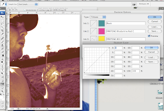
Above - This is the single colour process called Monotone.  Using tints from a select colour can give you great images even without the use of the full CMYK range.  


Above - Duotone image.  This is made of two colours you choose after going through the greyscale options. A lot of advertisements and publications use duotone.


Above - The options given while producing monotone, duotone and tritone images.  The box open closest allows you to change the curve (the amount of colour selected going into each area) 


Above - Tritone.  This is using the range of 3 colours as shown above, the next step would be full colour.


Above - Finally you come too full colour, this is using the full range of CMYK (Cyan, Magenta, Yellow, Black)

Illustrator - Swatches

In Mac-Suite 202 a lot is learnt, especially in the Illustrator workshops (because I rarely used this software previous to attending Leeds College)  
What are Swatches? - Well ... its the bar full of colour down the right hand side of the screen which is handy for picking pretty colours.  NO.  Its so so so much more than that!  It holds so many secrets and amazing tricks Anne Frank would have a fit!  
This workshop was very handy as it linked directly to a brief we just had, about using a limited colour pallet, tones, transparency's etc.  Below are examples and explanations of what we were taught about during the lesson.  

Swatches - Transparency!


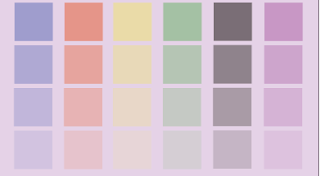
Above - This image shows how the transparency 'technique' works.  Down each column is half a strip of a mutual purple, this shows how the transparent colour makes a new one with the purple, or how it really is on the white canvas.


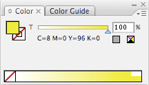
Above - 100% transparency makes this the full colour of which the other shades will be produced from. 


Above - This image shows how when the transparency of each colour drops, the background colour affects it and makes another colour / shade.


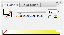
This print-screen shows 10% transparency is near enough white (depending on the background colour) 

Swatches - Tones!


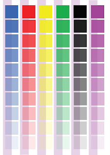
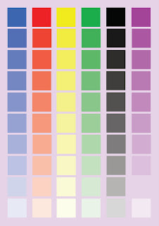
Above: A guide to show tones of colours.  The 100% tones are at the top of each column. Each column ends at 10%.  These are still full colours as the background shows, they have no transparency.  


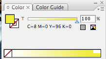
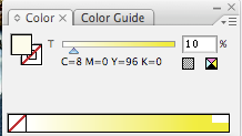
About shows my 'Spot colour' in the Swatches box.  You can see I have it set at 100% - this is what i adjust to get tints/tones of my colour.


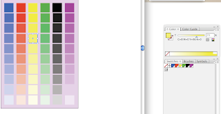
In this print-screen you can see the forth yellow down has been selected and my Swatches box is telling me the colour i have picked is a 70% tint/tone of my original colour.


This shows how my tints change from 100% - 10% ... even these are tints they are still full colour, not transparency's. 

What is Good?

Ok, so we had a crit today and I was kacking it - I had little work too show and if im honest I was shaking with nerves.  But it went well, I had an idea on what I wanted too do, and after a long chat with part time tutor Graham and my fellow class mates, I took my idea from 'New Zealand' too 'Franz Josef - New Zealand.' 
Why did i do this?  Well during the crit, we were told to not have such a vast subject ie: New Zealand.  Instead we were told to focus on a certain area/subject that interested us ... for me, where better than Franz Josef - the town in New Zealand that I nearly stayed in, instead of coming back too uni!
Here are a couple of images too give you a general idea of Franz Josef - small town with a glacier, in the middle of a rain forest, with a popula
tion of less that 500 people ...


Tuesday 6 October 2009

What is Good?

Ok ... so I have been producing a long list of things which i consider as 'good'
The list includes such things as: My grey hat, classic mini, New Zealand, tattoo's, graphic design, family, strip bars, love, skysports, porn, magic, toilet paper etc!
However after a long time staring at my design sheet full words, i chose my final 5 too develop upon, these are:

1. Sky-diving
2. Beer trophies
3. Tattoo's
4. New Zealand
5. Rules of shotgun

So I decided that I would list reasons to why i thought each of my final 5 was 'good' below! This uses secondary research, all images used
have references to where i found them.

Skydiving -

Why is skydiving good? Because of the crazy characters and jumpers, the free falling, the flight up to 'x' number of feet, the stories, freestyle, the buzz, jumping out the plane, up to 200-mph, endless smile!

Beer trophies -

Why are beer trophies good? Because of the stories, endless laughter, waking up the next morning not having a clue, its crazy, funny, memories, number of objects, size of objects, value of objects, the buzz!

Tattoo's -

Why are tattoos good? Because it could be a mark of respect, hold memories, a story, colour, beliefs, personal, current, artistic, imaginative, size, traditional, original and beautiful!

New Zealand -

Why is New Zealand good? Because its sunny (the weather) beautiful scenery, nice people, less crime, same size as the UK - but half the population, plenty too do, cheap, easy living, extreme sports capital of the world ... amazing place too be!

Rules of shotgun -

Why are rules of shotgun good? Because its a fun game too play on long journeys, stops arguments on who is sitting where, always a laugh, can be crazy, funnier with more people!

Monday 5 October 2009

Powerpoint Presentation

Our summer project was broken down into two areas. 

1 - too keep a journal of our summer (a graphic representation) 
2 - produce a short (5 minute) presentation about different aspects of print

So after the presentations in small groups of 5 were told too put our slideshows on our blogs. Not a problem only my presentation fell apart when 4 slides failed too open and this blog wont load my presentation.  So as a compromise I'm putting up some of my images which I used in my presentation, along with information about each print technique and stock uses etc. 

The book shown above titled "Print and Finish" by Ambrose/Harris is what I used for the majority of my research for the Print Production presentation.  This is a book that I would recommend to anyone wishing to gain some knowledge on different types of print and stock that can be used too print on.

Above: Duplexing - refers to the bonding of two substrates to form a single one.  This allows a stock to have different colours, texture and finishes on each side.  

Above: Stocks - each card shown above uses a different stock paper and applies a series of different finishing techniques, such as foil blocks and varnishes to create an array of interesting effects.

Above: Silk screen printing - this form of printing imposes an image on to a substrate by forcing ink through a screen that contains the design.  This is nit a high volume printing method because each colour that is applied to the substrate has too dry before another can be applied.  

Above: Screen print and Emboss - this design is screen printed onto onto grey board stock, embossed and given a clear varnish coating.  The varnish gives the screen print extra prominence and highlights the contrasting rough texture of the board while giving tactile difference in the surface.