Here are 3 logos which i found during my search. These logos all offer different design techniques which are mainly based around the typography.
- The Paramore logo is a very simple yet affective. Its both bold and eye-catching with a haggard finish (the design is very much influenced by the genre of music and the fans who support them when touring and purchasing murchandise etc.
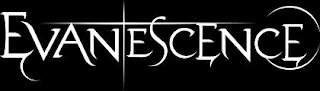
- The Evanescece logo is very much the opposite to Paramore. The font is of a better quality - it consists of smooth, flowing lines, some added extras to tails of some letterforms which all adds character to the design. Although this is a flat black and white copy of the logo - it is key to say that this is the colour pallet used by the designer. Again like the Paramore logo the colour pallet is essential to relate directly to the followers of the band.
- The Steepwater Band's logo is a bit different from my other 2 examples. This logos font seems to have been hand rendered (which is very good) with a large outlined stroke to compliment the text. I like this design - and feel that although the font is not suitable for my bands genre of music - the concept of hand rendered type is a possibility.


.jpg)


No comments:
Post a Comment